

From Packaging Mismatch to a Cohesive Family
CASE STUDY: BUONA FOODSBringing a beloved family-owned food brand into a new packaging era.
A legacy food brand comes with something you can’t manufacture: history.
This family-owned American Italian food company out of Chicago, Buona, had decades of brand recognition and a loyal customer base. But its packaging had become a bit of a patchwork over the years. Different products had different visual approaches, making the overall portfolio feel less like one brand and more like a collection of individual products.
The brand itself had recently been refreshed, creating a strong new visual foundation. The next challenge was bringing that identity to the shelf.
That’s where I came in.
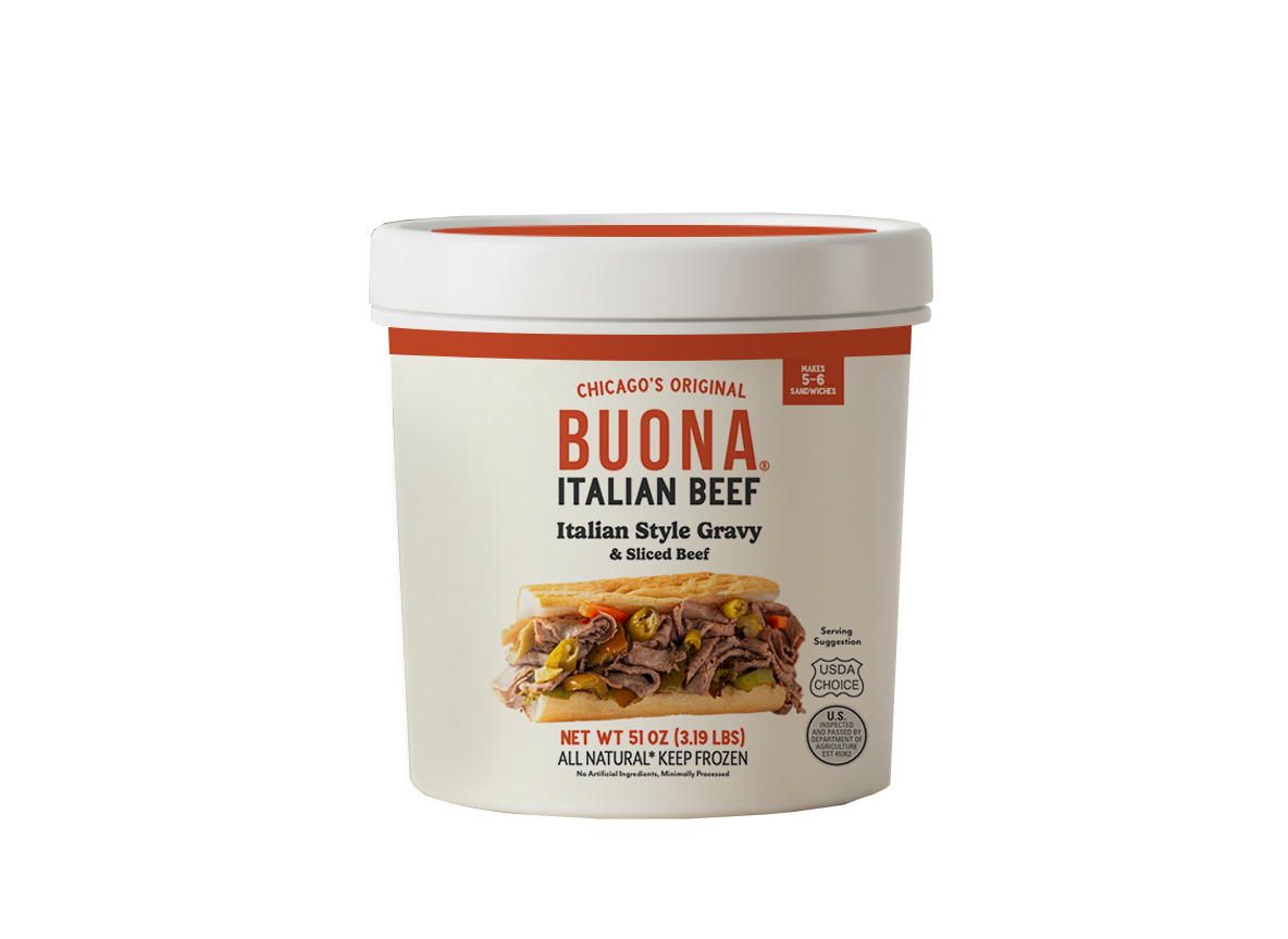
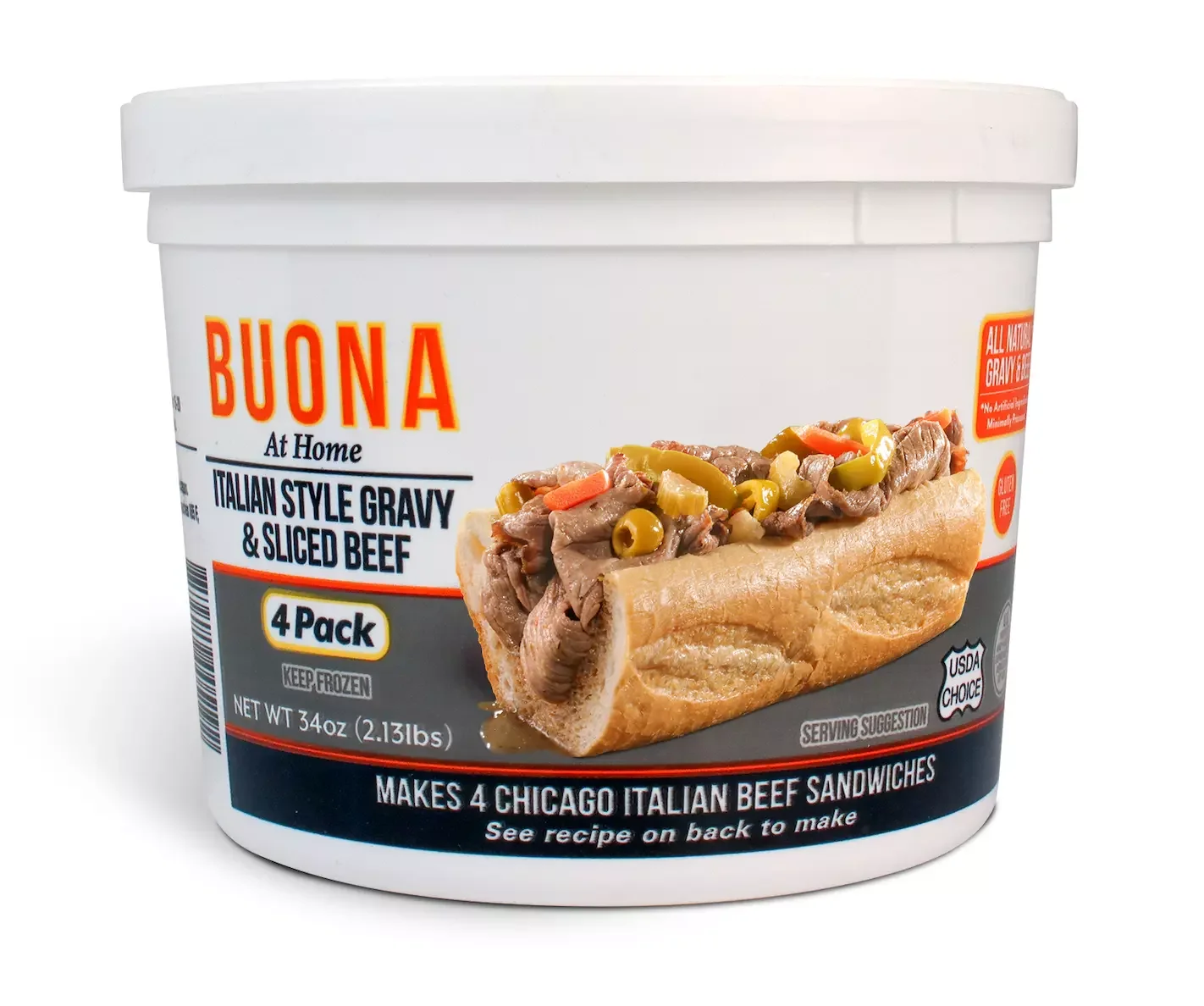
Packaging design for Buona – mockup of frozen plastic tub packaging for meat
The Challenge: translating a brand book into packaging
The company had recently finished a rebrand, so they had a nice look, but the packaging hadn’t caught up.
There was the restaurant side of the business with products for sale, and current retail product lines, and some product kits for online DTC sales. The product lineup included everything from Chicago-style beef (what they’re most famous for) to sauces like marinara, condiments like their hot and mild giardiniera, and other meal kits like their meatballs. Each product, in each sales category needed to comply with its own packaging requirements , but feel like part of the same personality. The goal wasn’t to make every package identical. It was to create a recognizable packaging family that could flex across multiple product lines while still feeling unmistakably like the same brand.
There was also a practical side to the project. The packaging needed to work within real-world food production and printing requirements, including USDA-compliant food packaging considerations for fresh and frozen foods. There were labels to print, and tubs being dry offset printing on plastic tubs that had printing limitations (and came in multiple different sizes!).
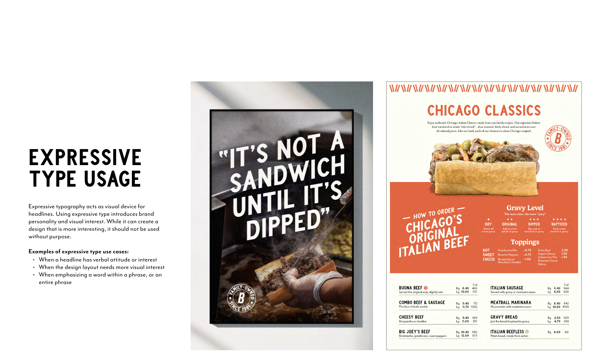
Brand guidelines example: there was some nice, fresh styling in the branding
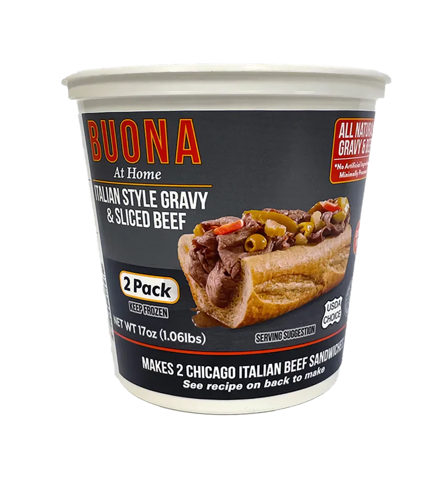
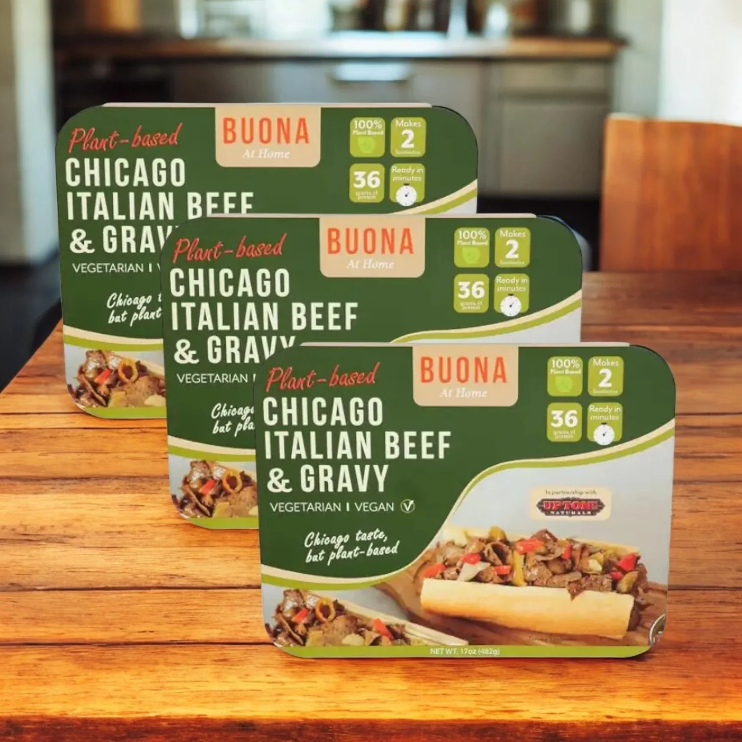
BEFORE: The existing packaging was a bit all over the place.
The Approach
I started by translating the recently refreshed brand identity into a packaging system. Using some design cues from the brand marketing designs, but building from them. What visual elements should stay consistent? What kind of elements to introduce into the mix? Where could individual products have their own personality? How could the hierarchy work across different package sizes, formats, and product categories?
Strong brand elements create recognition across the portfolio, while color, product photography, typography, and supporting graphics help shoppers quickly understand which product they're looking at. These products had the added challenge of the product line hardly ever being seen together, the products were usually scattered across the store.
We started with the flagship product, the Chicago Style Beef. Once that foundation was established, the same packaging language could be adapted across additional product lines.
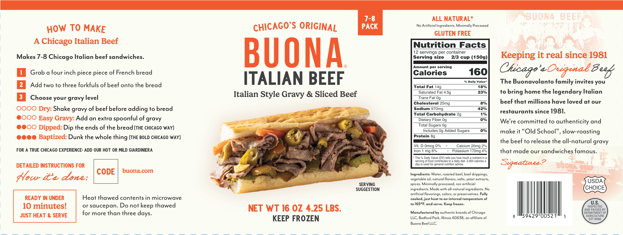
Original version 1 concept had more decorative photos from the family’s history, but the screened images were nixed in the end due to technical issues printing them.
Food Packaging That Works in the Real World
Food packaging has a lot more to solve than looking good.
I worked closely with the brand’s legal team to review packaging requirements, analyze compliance considerations, and identify potential issues before production. From there, I refined the designs as needed, making sure the packaging stayed visually strong while meeting the necessary regulatory requirements. That’s polite way of saying “went back and forth in figuring out how close to the photo the serving suggestion line needed to be”.
For this project, the designs needed to account for the realities of commercial food packaging production, all the required product information like nutrition panels being in the correct size, print specifications with areas on the plastic tubs that would smear, minimum type size requirements from both the USDA/FDA food packaging regulations plus the printers minimums. The limitations of printing directly onto plastic tubs means no transparency or gradients, all elements need to be thick and large, and there are large areas where no print can go, called no print gaps, and more areas where nothing important can go in fear of the smear, as the tubs were all tapered.
The Chicago Beef packaging was produced using dry offset printing, a common printing method for plastic containers that allows the artwork to become part of the container rather than a label or digital. This is old skool: We did a custom colored tub, white, orange, and black Pantone screenprinted ink, and the image of the sandwich with process printing.
That meant the design had to be developed with both the brand and the manufacturing process in mind.
Because great packaging isn't just about what happens on screen. It has to survive the printing press, a production line to fill, storage, transit, and grocery shelf time, frozen, defrosted and then an actual hungry customer.
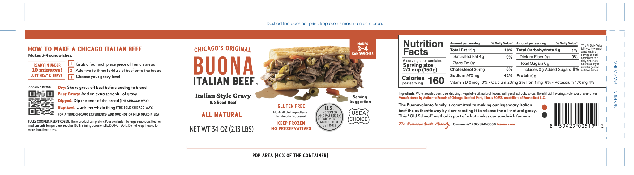
Smallest size needed to still fit all the same content than the larger ones
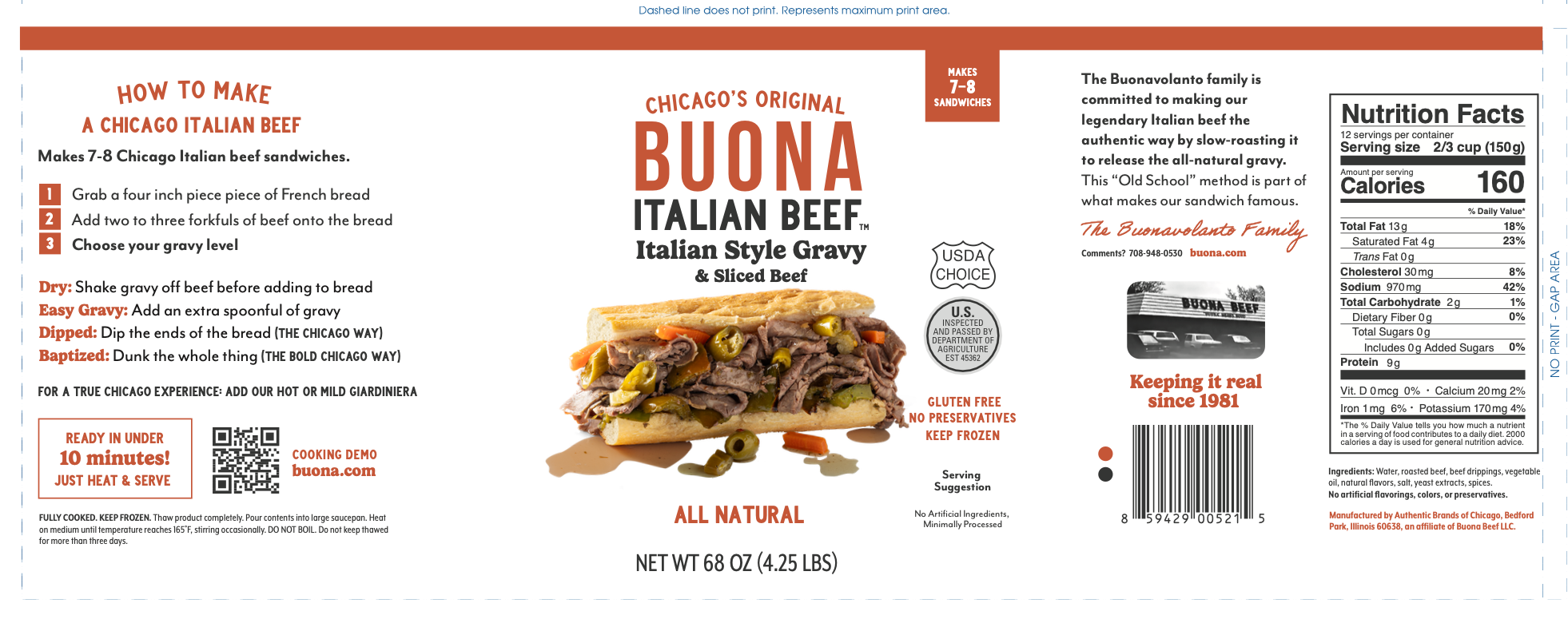
The foodservice and “Costco sized” product had more room for the full design.
The Result
I developed the packaging system and visual direction across four product lines, establishing the design language, hierarchy, and design approach. The client later on adapted the artwork internally before final production.
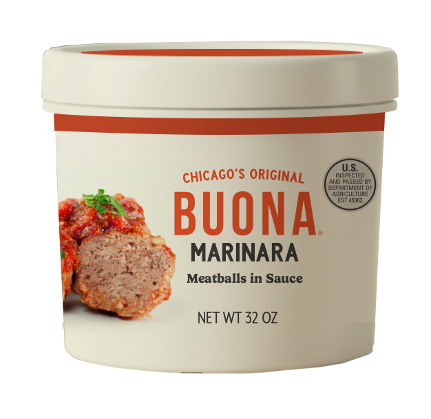
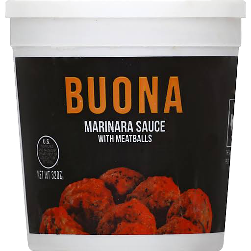
After (left) and before (right) of the meatball tub
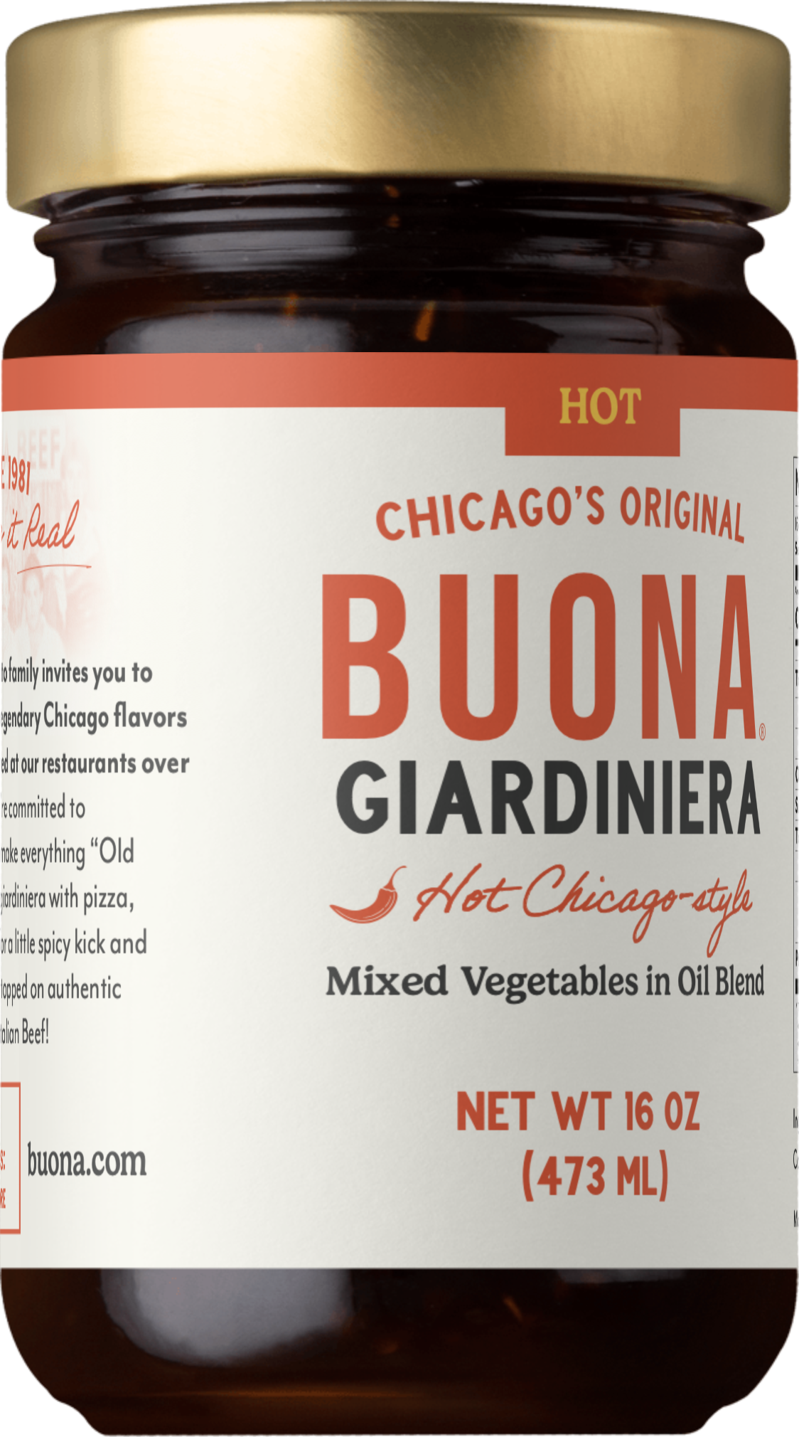
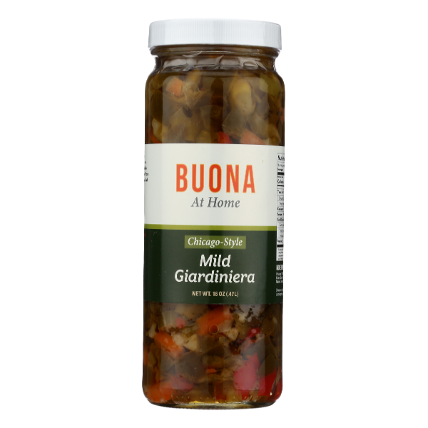
After (left) and before (right) of the giardiniera tub
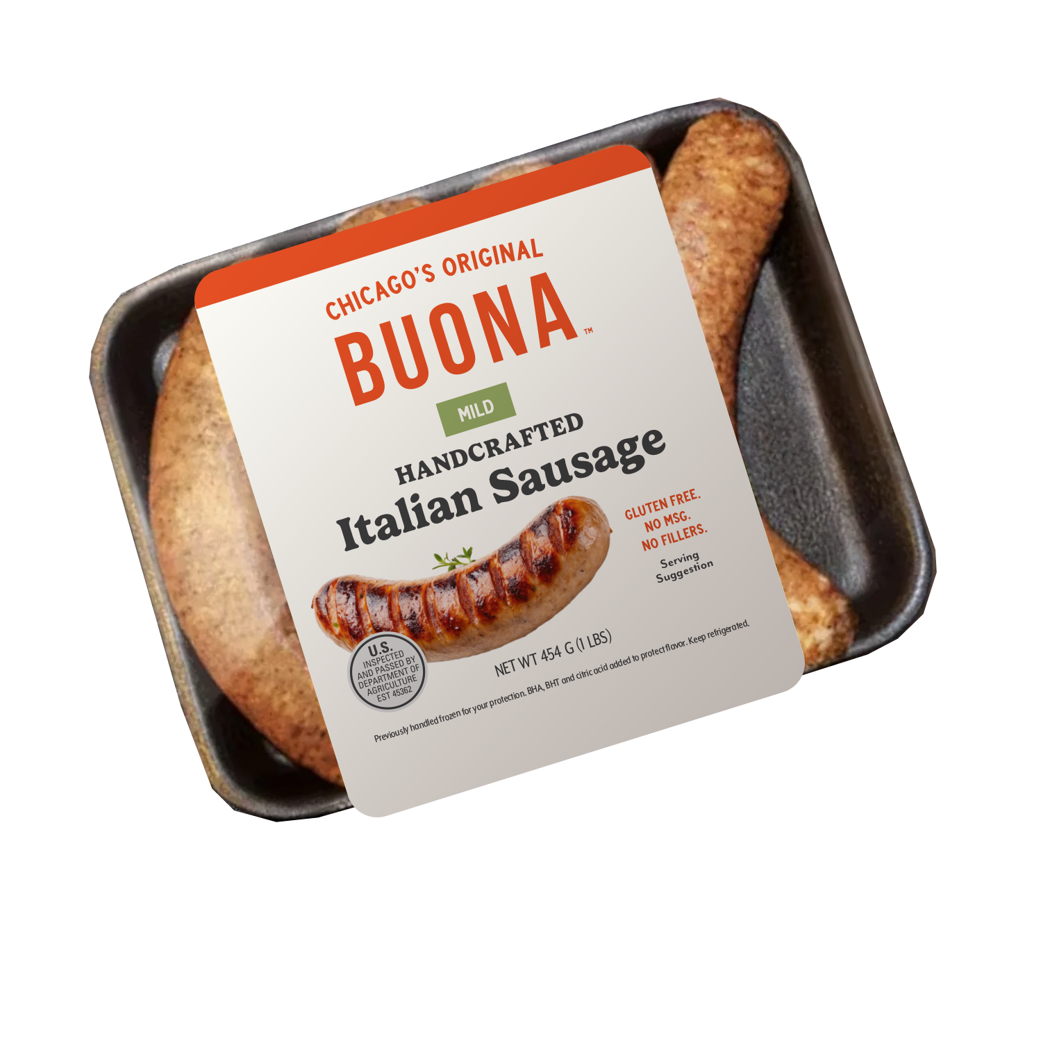
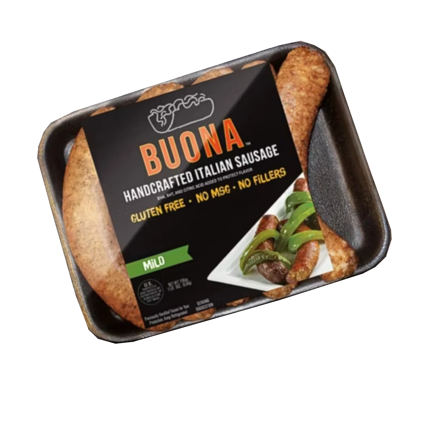
After (left) and before (right) of the Italian sausage tray label design. We were also thinking about a cardboard sleeve, but ended up keeping the label for simplicity.
Looking for food packaging that can actually work on shelf?
I help food and CPG brands turn strong ideas into packaging that's strategically considered, visually distinctive, and ready for the real world – from brand-new products to legacy brands that need their packaging to catch up with the business.