WELLNESS PRODUCT LABEL DESIGN
Cannabis edibles label
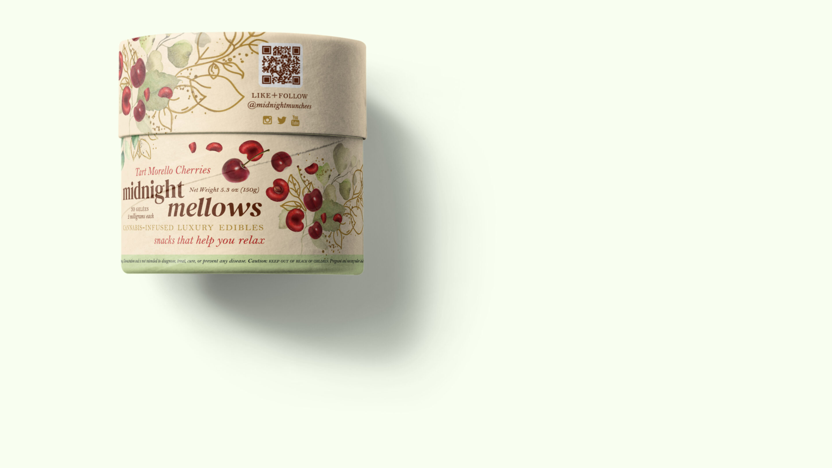
Printer company CBD and cannabis label showcase design example
Showing off the capabilities of a label printer through realistic looking, but fake brand packaging labels.
CLIENT: Prose Media
CONTENT + BRIEF: from the client

Fictional branding for a Oregon cannabis edibles brand, part of a showcase label series for a printer company. The concept here was to make something luxury and feminine, natural and clean. The design featured gold metallic flecks and watercolor designs. There was a spot gloss applied to the cherries to make it extra scrumptious. This all to to show off the printers capabilities for metallic printing.
Designed to look like a label design for a real cannabis edibles brand from Oregon, inspired

Imagining this brand in a plastic free paper tube packaging, wrapping all natural cherry goodness into paperboard, instead of plastic, like most edibles.
Ready to start your packaging project?
