FOOD PRODUCT LABEL DESIGN
Sauce label design
Printer company food product label showcase design example
Showing off the capabilities of a label printer through realistic looking, but fake brand packaging labels.
CLIENT: Prose Media
CONTENT + BRIEF: The idea for the product was to make it look like a higher end sauce brand, like something you might see at a foodie artisanal store, or at a Williams Sonoma type store.

What makes a good tomato label design?
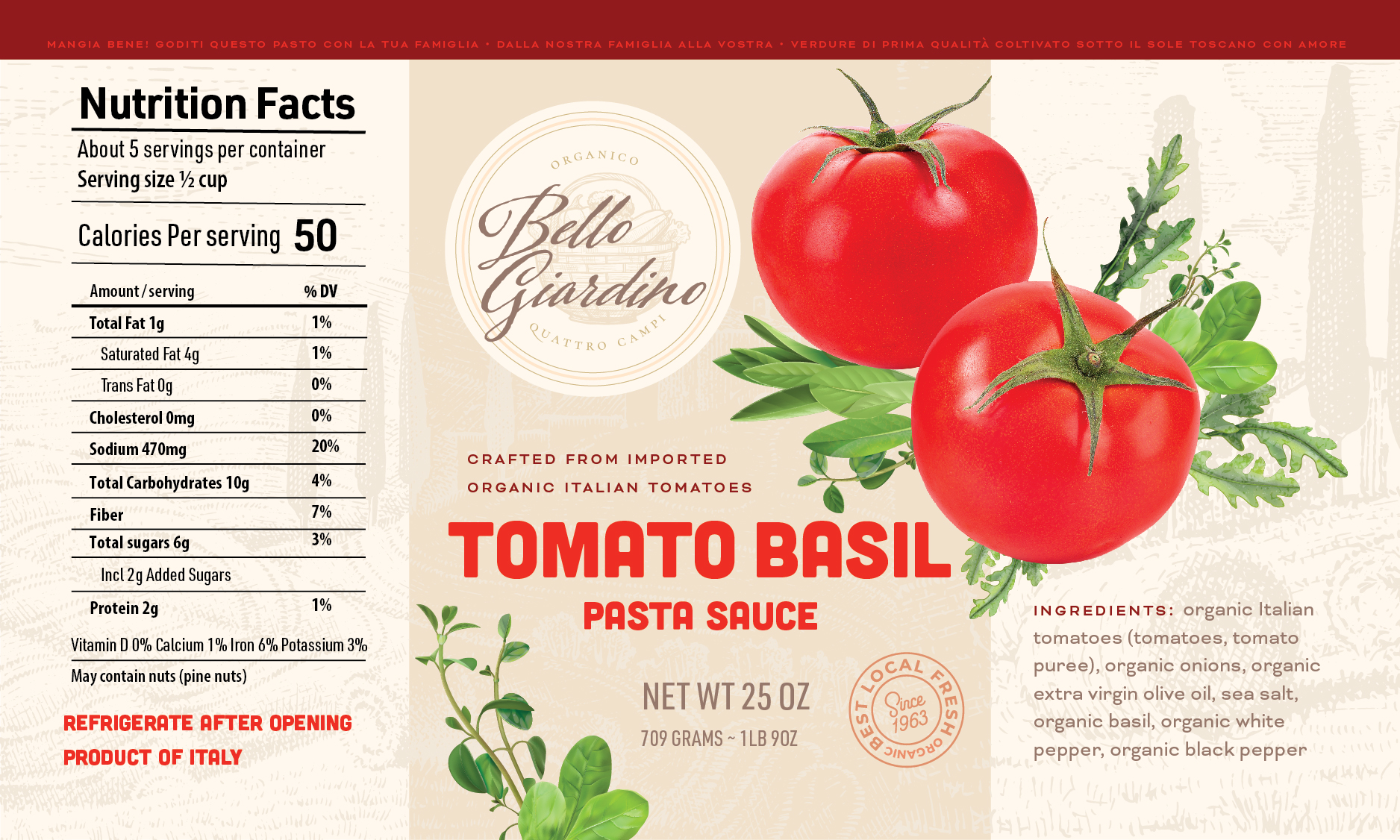
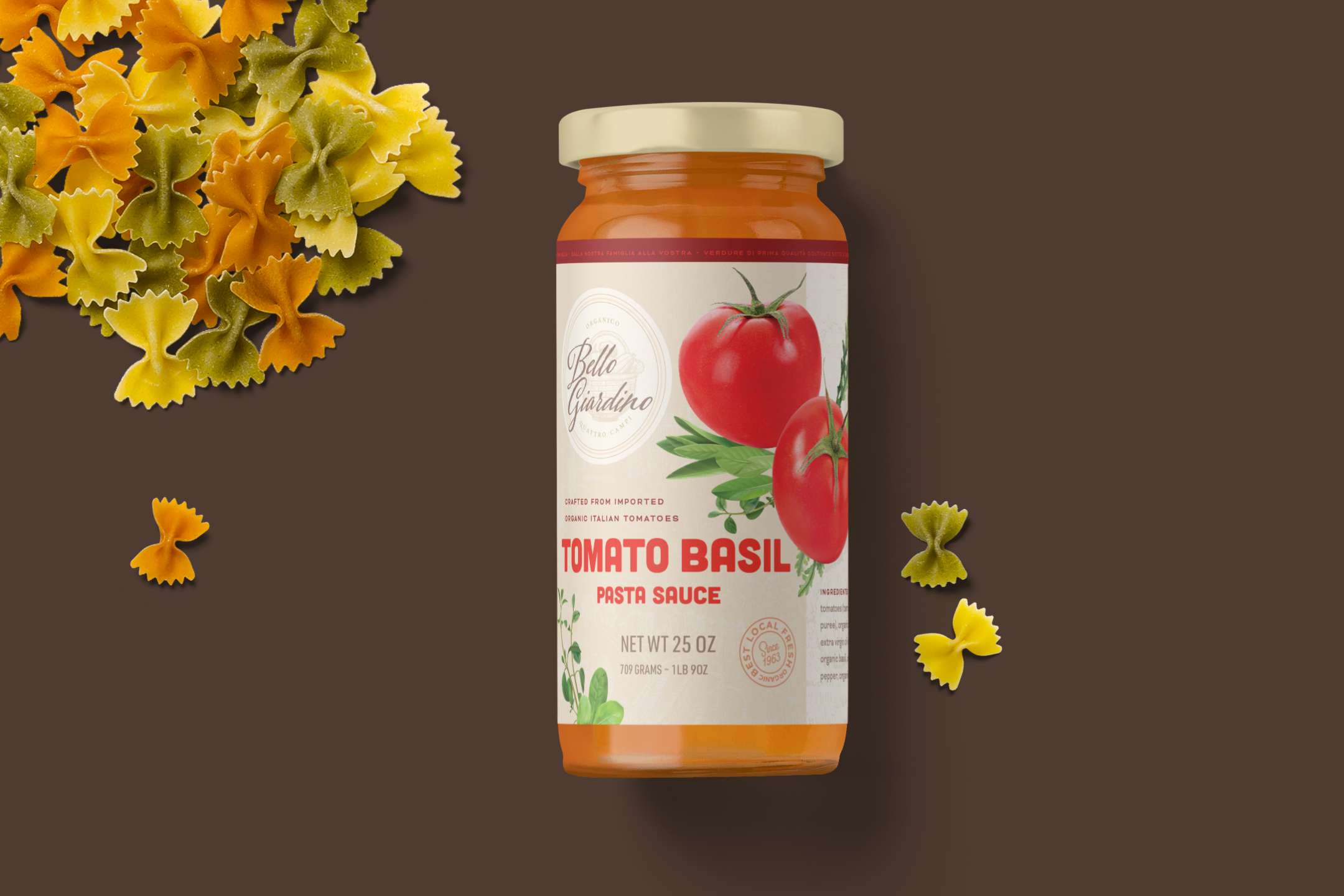
Fictional branding and label design for a Italian tomato sauce brand, part of a showcase label series for a printer company. The concept here was to make something high end grocery store looking, in the style of a Williams Sonoma product. My goal was to make a pretty label, more than a realistic one – this is a fake product for showing of the printing capabilities of the client. This particular label used a spot gloss tactile effect for the digital label printing.
What was my approach? Since this was a quick turnaround project, I started with finding some delicious looking illustrations. Loved these realistic (vector!) herbs and tomatoes, so that made this a flavored sauce. (And yes, I know there’s thyme, arugula, sage, and basil, I think one is an oregano, and those are not listed on the label, because the word basil looked nicer – artistic license allowed by a fictional project!)
So what are the best colors for a tomato label? I wanted this to feel warm, vintage vibes – so warm beiges and taupes make the tomato red colors pop. Often labels are all red, or all green, dark colors. I liked the idea of a lighter, “pasta bag” look. The illustration of a Tuscan countryside scene in the background brought more charm. The logo is a quickie as well: just a stock illustration and some type. Sorry for all Italian speakers reading this – the content is kinda nonsensical, I took some Spanish in middle school, and read a Berlitz language course book before traveling through Italy during my “Grand Tour” across European art capitals.
Even though this was not a real grocery store food label, I wanted to include most information that should be included on a tomato label: net weight, product identity, ingredients listing, allergy warning, nutritional panel (with lots of artistic license on how it looks!).
What are the latest trends in food packaging design including tomatoes? I’ve seen this trend for old timey nostalgia style label design being very popular. Wondering when an ultra minimalist Gen Z looks arrive in canned vegetable label design? Would be fun to see a Goodles style label for tomatoes. Labels, and packaging design in general, question researched by a lot of design agencies and trend reporters is how does label design impact sales of tomato products. I’m not personally sure, but what I can say, is that one time I was asked for my opinion on a well known tomato sauce brand’s labels, and the one I liked, they ended up going with a year later. I felt vindicated! I have taste, I’ve got style!

The design features realistic tomato and herb renderings, and a Tuscan scene in the background, tone-on-tone. This all to to show off the printers capabilities for fine color printing. Inspired by food packaging one could find on a shelf at a fancy deli or at a Whole Foods. Just don’t look too closely on the italian text – I only took Spanish in school so this is all placeholder Google Translate gobbledygook.
Looks good enough to eat, mangia tutti!
See other projects:
Food packaging
Want to find out how to make your own tomato sauce pasta sauce labels?
I love to connect with new people, learn about your business, and hear about your hopes and dreams.
